Case Study
Cloud Theory AI
Designing dashboard experiences with AI-generated summaries to enable faster at-a-glance reporting and accelerating design system adoption across teams.
Case Study
Designing dashboard experiences with AI-generated summaries to enable faster at-a-glance reporting and accelerating design system adoption across teams.
Cloud Theory is an AI-powered platform for cloud infrastructure management. As Staff Product Designer, I designed dashboard experiences with AI-generated summaries, conducted user research and usability testing, and improved design system efficiency to accelerate adoption across design and engineering teams.
I leveraged AI tools including Subframe, Cursor, Figma Make, Claude, and ChatGPT to speed up prototyping and iteration — pushing the boundaries of how AI can augment the design process itself.
Cloud infrastructure teams were overwhelmed by data but starved for insight. Dashboards presented raw metrics without context — requiring deep expertise to interpret and slowing down decision-making across the organization.
Teams needed a way to quickly understand the state of their infrastructure at a glance, without sifting through dozens of charts and alerts. The reporting experience was fragmented, and onboarding new team members to the existing tooling took far too long.
Cloud Theory needed a platform that could transform dense infrastructure data into AI-generated summaries — delivering actionable intelligence instead of raw numbers, and making every team member immediately productive.
"I spend more time building dashboards than actually acting on the data. By the time I understand what's happening, the window to respond has passed."
— Infrastructure Engineer, Discovery Interview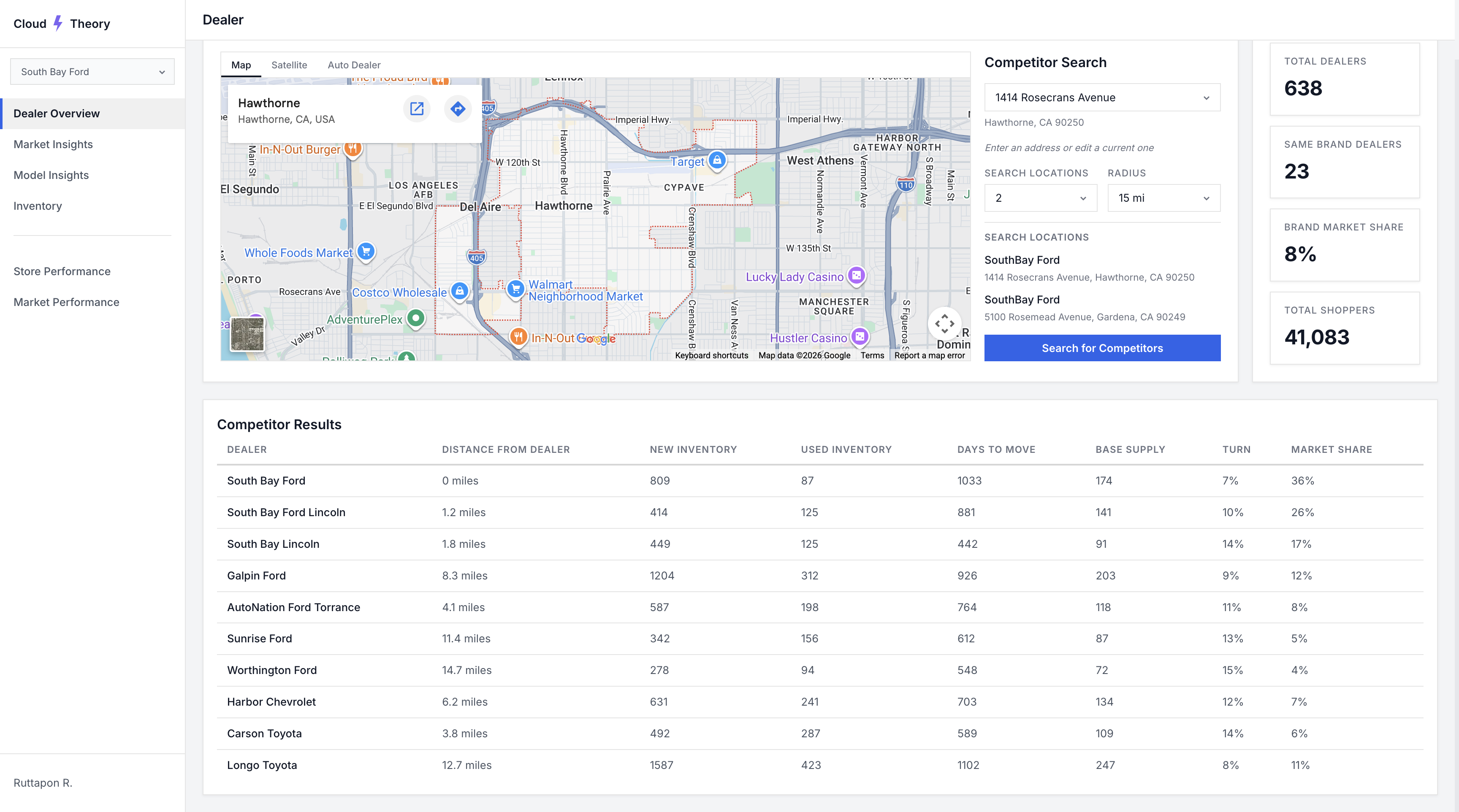
The legacy Cloud Theory experience — sharp edges, outdated design, and clunky UI with no contextual insight
I conducted user research and usability testing to validate design decisions and guide product direction. This included interviews with infrastructure engineers and DevOps teams, analysis of existing reporting workflows, and competitive audits of dashboard tooling across the market.
Three critical patterns emerged from our research that reshaped our entire approach to the product.
Engineers had too many dashboards with too much raw data. They needed summaries, not more charts — AI-generated insights that surface what matters without manual interpretation.
Users needed to understand their infrastructure state in seconds, not minutes. The existing experience required navigating multiple views just to answer basic questions about system health.
Inconsistent component usage between design and engineering slowed development. Teams needed a unified, efficient design system to accelerate adoption and ensure product consistency.
Our research revealed that the core problem wasn't a lack of data — it was a lack of meaning. Teams had plenty of metrics but no way to quickly understand what they meant for their operations.
We reframed our design challenge:
"How might we use AI to transform raw infrastructure data into plain-language summaries that enable faster, more confident decision-making?"
— Design Challenge StatementThis reframe shifted our focus from building more dashboards to designing an AI-powered reporting experience that tells the story of your infrastructure — meeting users with insight instead of data. From there, three guiding questions framed every design decision that followed:
Translate dense infrastructure metrics into clear, plain-language summaries so teams can grasp system health at a glance — no manual interpretation required.
Surface the next best action alongside the data. Pair AI-generated insights with confident recommendations so users move from "what's happening" to "what to do" in seconds.
Connect infrastructure performance to revenue outcomes — highlighting opportunities, market shifts, and trends that drive measurable business growth.
I explored multiple dashboard concepts — each taking a different approach to surfacing AI-generated summaries. Leveraging AI tools including Subframe, Cursor, Figma Make, Claude, and ChatGPT, I was able to rapidly prototype and iterate at a pace that would have been impossible with traditional workflows.
This AI-augmented process allowed us to test structural assumptions quickly before investing in high-fidelity design, running concept tests with users to validate information architecture and interaction patterns.
 Rigid layout
Hard corners throughout
Rigid layout
Hard corners throughout
 Outdated visual design
No actionable takeaways
Outdated visual design
No actionable takeaways
 Cluttered interface
Overwhelming data density
Cluttered interface
Overwhelming data density
Legacy screens analyzed during exploration — sharp edges, outdated styling, and clunky UI across every view
The final design synthesized the strongest elements from our explorations into a dashboard experience centered around AI-generated summaries — giving users faster at-a-glance reporting that transforms raw infrastructure data into plain-language insights.
I also improved the design system's efficiency to accelerate adoption across both design and engineering teams, ensuring consistent implementation and reducing handoff friction throughout the product.
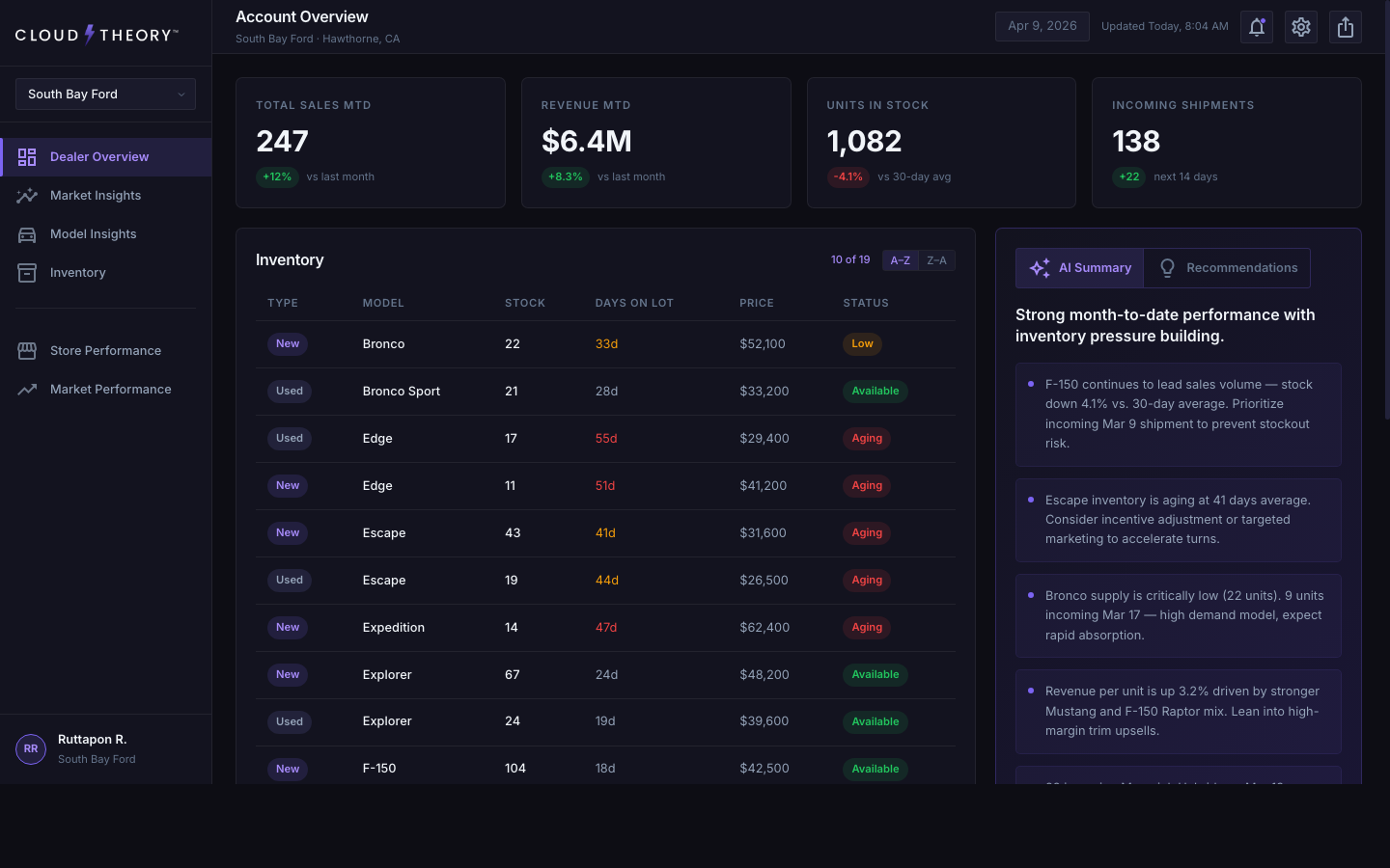
The redesigned AI-powered dashboard — contextual summaries replace raw data
Model Insights — vehicle-level analytics with a left filter rail flush against navigation
Six standout additions that shaped the redesigned experience — from AI-driven storytelling to refined data visualizations and a smarter information architecture.
Plain-language headlines and contextual insights that translate raw dealer data into immediate understanding — no chart-reading required.
Actionable next steps surfaced alongside the data, turning passive monitoring into confident decision-making.
Interactive geographic visualization that reveals dealer reach and sales density at a glance.
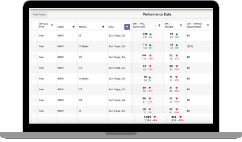
Days-on-lot warnings, sortable columns, and lazy loading make scanning long inventory lists effortless.
An at-a-glance bar chart that surfaces monthly performance trends without leaving the dashboard.
Compare performance across accounts in a single click — no extra navigation, no context loss.
Special attention went into how AI summaries are presented — using progressive disclosure so users can start with a high-level overview and drill into details on demand. The transition between summary and detailed views needed to feel seamless and maintain spatial context.
I designed loading states that give users confidence the AI is processing their data, error handling that gracefully degrades to manual views, and empty states that guide new users toward their first meaningful interaction.
One of the most impactful decisions was refreshing the core visual language. The legacy dashboard relied on hard corners, flat contrast, and a dated color palette that felt disconnected from the modern tools our users open every day. We updated the system to feel contemporary, trustworthy, and at home alongside the design tools teams already rely on.
Rounded corners — We moved from sharp 2px corners to a softer, more modern radius scale. Rounded geometry creates a friendlier read at-a-glance and matches the visual conventions of modern SaaS tools, reducing the cognitive load of scanning dense data.
Higher contrast — We pushed text, surface, and accent tokens toward higher contrast ratios to improve scannability and meet accessibility standards. This was especially important for the dense inventory tables and AI summary panels, where users need to parse information in seconds.
Modern dark-mode palette — We rebuilt the palette to feel native to today's design tools — closer in tone to Figma, Linear, and Vercel — using cooler neutrals and a more saturated brand accent. This made the product feel current, signaled product maturity, and gave our design system colors that teams across the organization were immediately comfortable adopting.
I conducted usability testing to validate design decisions and guide product direction. Through iterative testing rounds, we refined the AI summary format, the dashboard layout, and the design system components to ensure they met real user needs.
Key findings from testing directly shaped the final product — from how summaries are structured to how users navigate between overview and detail states. Each iteration was informed by direct user feedback and behavioral observation.
"This is the first time I've opened a dashboard and immediately understood what was happening without clicking into anything."
— User Testing ParticipantMeasurable outcomes that validated our design decisions.
To quantify the impact of the redesign, I ran unmoderated usability studies with Maze, our UX research platform of choice. Participants completed the same set of at-a-glance reporting tasks on both the legacy dashboard and the redesigned experience. The results showed users spent 22% less time analyzing the dashboard to reach the same decisions — a direct validation that the AI summaries, updated visual system, and restructured information architecture were doing their job.
"The AI summaries changed how our team interacts with dashboards. Instead of digging through charts, we get the story immediately."
— South Bay FordHonest reflections on the process and the outcomes.
Leveraging tools like Subframe, Cursor, Figma Make, Claude, and ChatGPT fundamentally changed my prototyping workflow. AI doesn't replace design thinking — it compresses the iteration cycle so you can test more ideas, faster.
The biggest insight was that users don't want more data — they want understanding. Designing AI-generated summaries that tell a story rather than present numbers required a completely different approach to information hierarchy.
Improving the design system wasn't just about consistency — it directly accelerated how fast both design and engineering could ship. The efficiency gains compounded over time, making every subsequent feature faster to build.