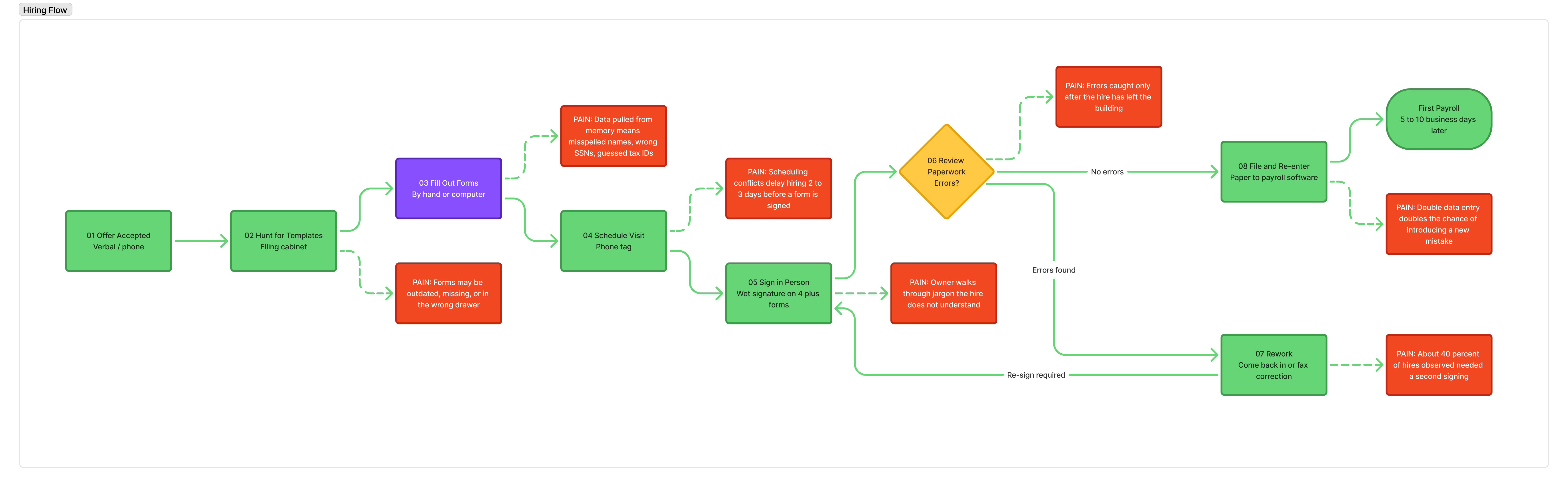
Interviews could only get us so far. Before committing to an information architecture, I wanted to see payroll as it actually happens — not how owners described it, but how they physically did it. I spent time onsite with six small businesses across different industries: a bakery, a coffee shop, a boutique retail store, a graphic design studio, a landscaping company, and a dental practice.
I shadowed owners through parts of their actual workdays, asked them to walk me through how they’d set up payroll for a new hire if they had to do it right now, and paid attention to what happened between clicks — where they looked, what they pulled out of drawers, who they called when they couldn’t remember something.
“Hold on, let me find it — I think the W-4 is in the back office. Or maybe my accountant has it.”
— Bakery Owner, Field Study Participant
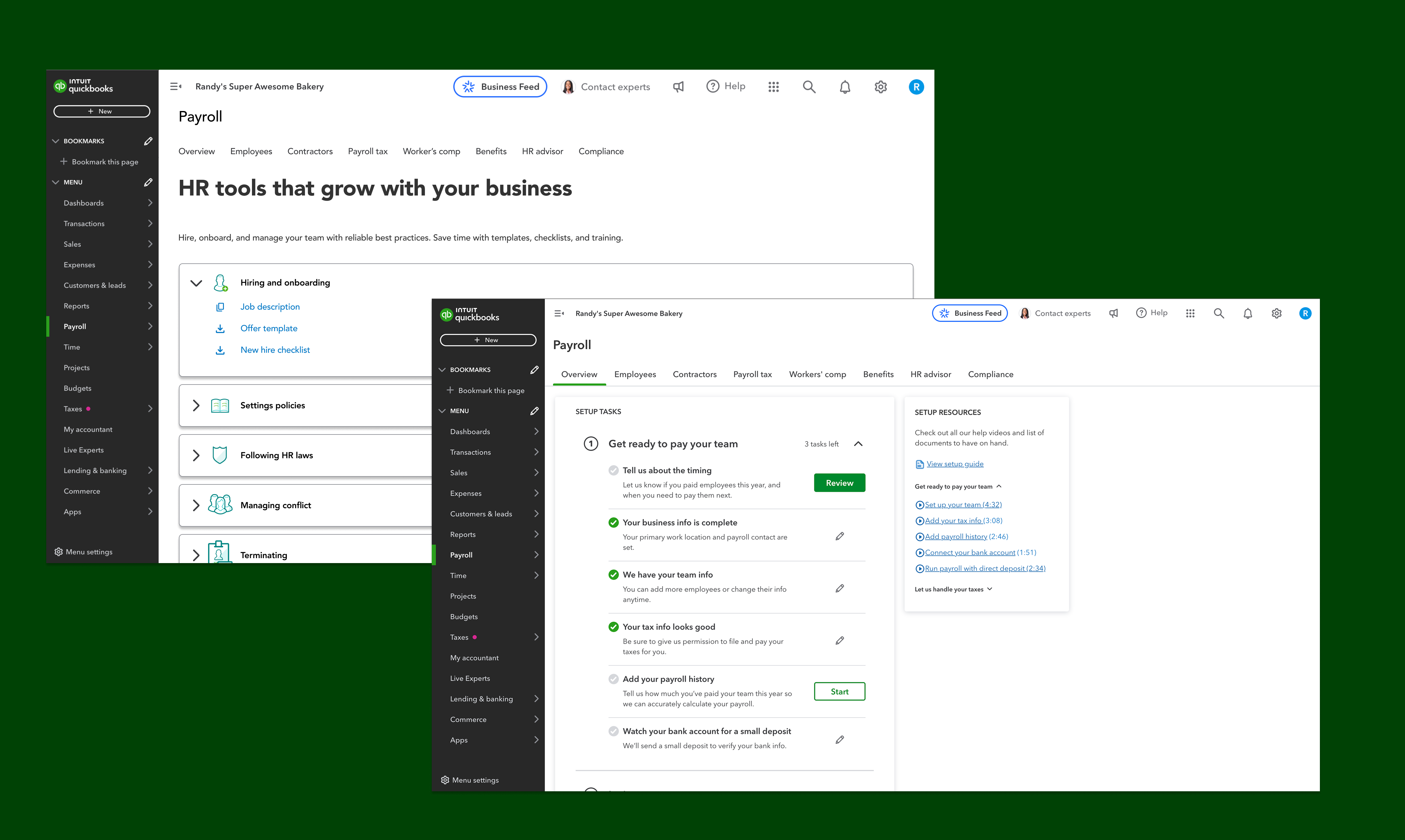
What I saw reshaped the entire onboarding architecture. Payroll isn’t a thing that happens inside QuickBooks — QuickBooks is the last stop on a document hunt that starts in filing cabinets, phone notes, email attachments, and shared drives. Any onboarding flow that assumed owners had their info ready at a keyboard was designing for a customer who didn’t exist.
inventory_2
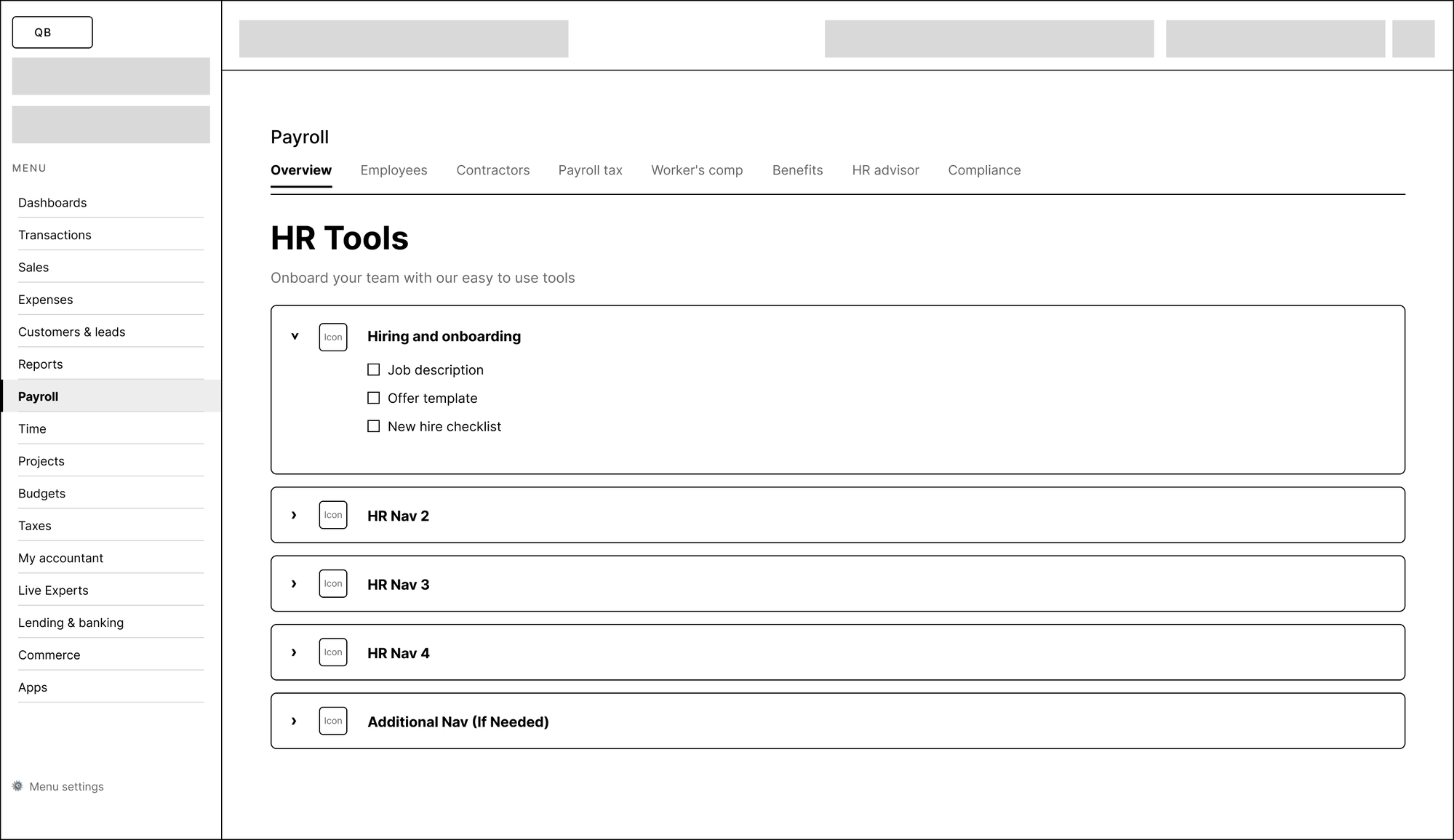
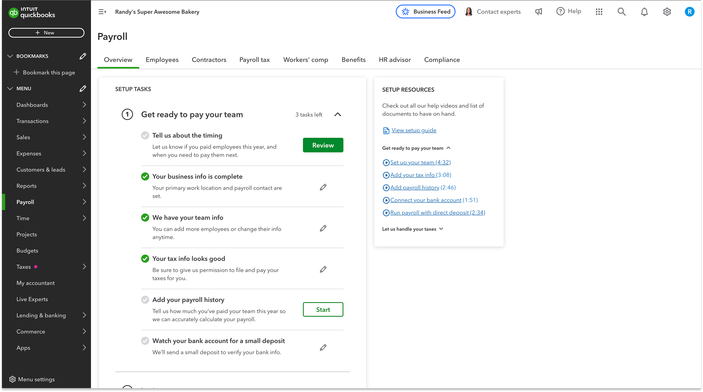
The Paperwork Is Physical
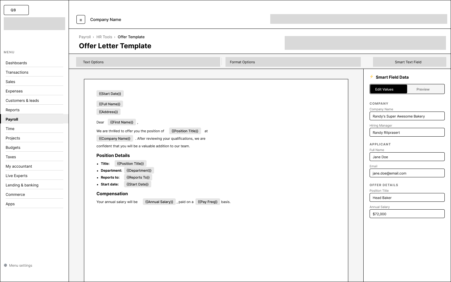
Employee I-9s lived in filing cabinets. Direct deposit forms were screenshots on phones. EINs were on a letter from the IRS taped to a wall. Not a single owner I visited had all their hiring documents in one place — let alone in a format QuickBooks could ingest.
notifications_active
Setup Is Always Interrupted
None of the owners I shadowed got more than ten uninterrupted minutes at a time. A phone call, a walk-in customer, a supplier delivery — the setup task always paused. Any flow that required an unbroken session would fail in the real world.
contact_phone
Memory and Phone Calls Fill the Gaps
When owners couldn’t find a document, they typed from memory or called their accountant. That meant misspelled names, wrong SSNs, and guessed tax IDs were landing in payroll software every day — and nobody caught the mistakes until a paycheck bounced.
These observations became the non-negotiables for the design: save-and-resume had to be the default (setup would span days, not minutes), every field had to hint at what document to grab (owners needed to know where to look), and optional fields had to stay truly optional (blocking progress on missing info would kill the flow entirely).