Case Study
FloQast Platform
Led Flow-UI, FloQast’s design system, scaling 40+ shared components across 8 product teams and integrating Zeroheight with Storybook to cut design–engineering discrepancies by 60%.
Case Study
Led Flow-UI, FloQast’s design system, scaling 40+ shared components across 8 product teams and integrating Zeroheight with Storybook to cut design–engineering discrepancies by 60%.
FloQast uses AI to automate accounting workflows — from close management and reconciliations to compliance. As the platform grew rapidly, the UI grew with it — but without a unified system.
I led the platform design system end-to-end as the sole Product Designer, supported by 6 design system designers and partnering with a 5-person platform engineering team under the CTO as executive sponsor.
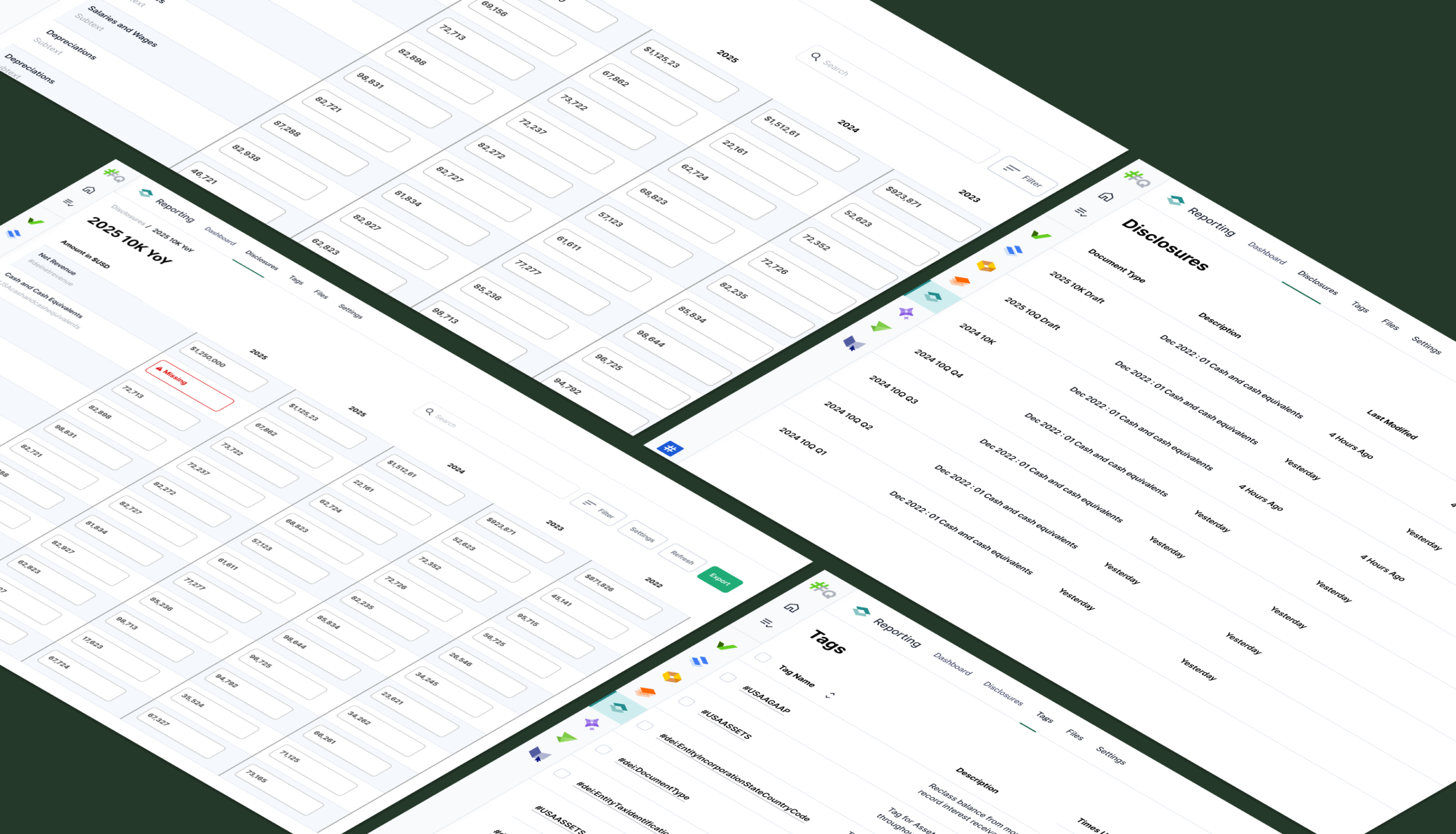
We audited every customer-facing surface across FloQast's platform and marketing site. This wasn't a quick check — it was a comprehensive cataloguing effort that revealed just how fragmented things had become.

floqast.com (2023) — the starting point of our audit
The product UI had accumulated years of design debt. Navigation wasn't scalable, action buttons were overloaded, and critical UI elements failed WCAG AA contrast requirements — orange warning text on white was indistinguishable for colorblind users.

Reconciliations page — the old product design with annotated usability and accessibility issues
A single search for "dropdown" in the codebase returned over a dozen variants — each built by a different team, at a different time, with different APIs.
Some were versioned (DropdownV2, DropdownV3), some were team-specific (dropdown_nav), and one was literally called DROPDOWN_BACKUP. Every new hire picked a different one. Every product surface looked slightly different.
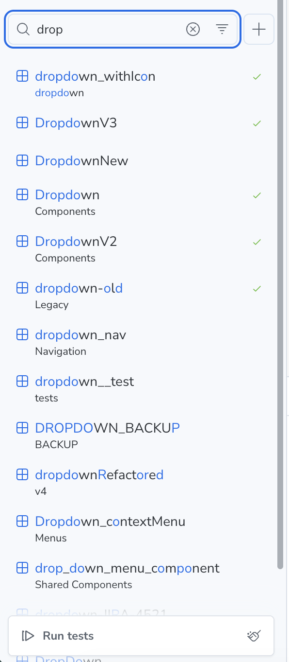
A single Storybook search revealing the component fragmentation problem
For public companies, non-compliance creates real business risk. This wasn't just about good design — it was about legal exposure, audit findings, and investor scrutiny.
Digital accessibility lawsuits surpassed 4,000 in 2023. A single case can cost $50K–$150K+ in settlements.
Inaccessible workflows prevent employees with disabilities from performing control activities — creating audit findings and material weaknesses.
ESG reporting now includes digital accessibility metrics — non-compliance signals governance risk that impacts valuation.
Quantified the wasted engineering hours from teams rebuilding the same components 3–4x and showed the payback period.
Designers and engineers co-authored every component spec from day one — shared ownership, not hand-offs.
The IPO timeline made accessibility violations a legal risk — the design system was the fastest path to WCAG AA at scale.
Pitched a 6-week pilot on one surface, measured the results, then used that data to justify the full investment.
We couldn't flip a switch and migrate everything overnight. Instead, we designed a three-phase adoption strategy.
Every pixel fights for its right to exist. If it doesn't guide the user forward, it's noise — and noise gets cut.
Think LEGO, not monoliths. Tiny, purposeful pieces that snap together — building everything from a simple form to an entire workflow.
Accessibility isn't a checkbox before launch. It's in the DNA of every token, every component, every interaction — baked in from the first commit.
3 engineers or 30. One product or ten. Flow-UI stretches without breaking — because a design system that can't grow is just a style guide with ambition.
Every component ships with usage guidelines, do's and don'ts, and Storybook examples — all published before merge. We also created a governance decision tree so teams could quickly determine whether to use, compose, request, or build components.
The goal: make using the system easier than going around it.
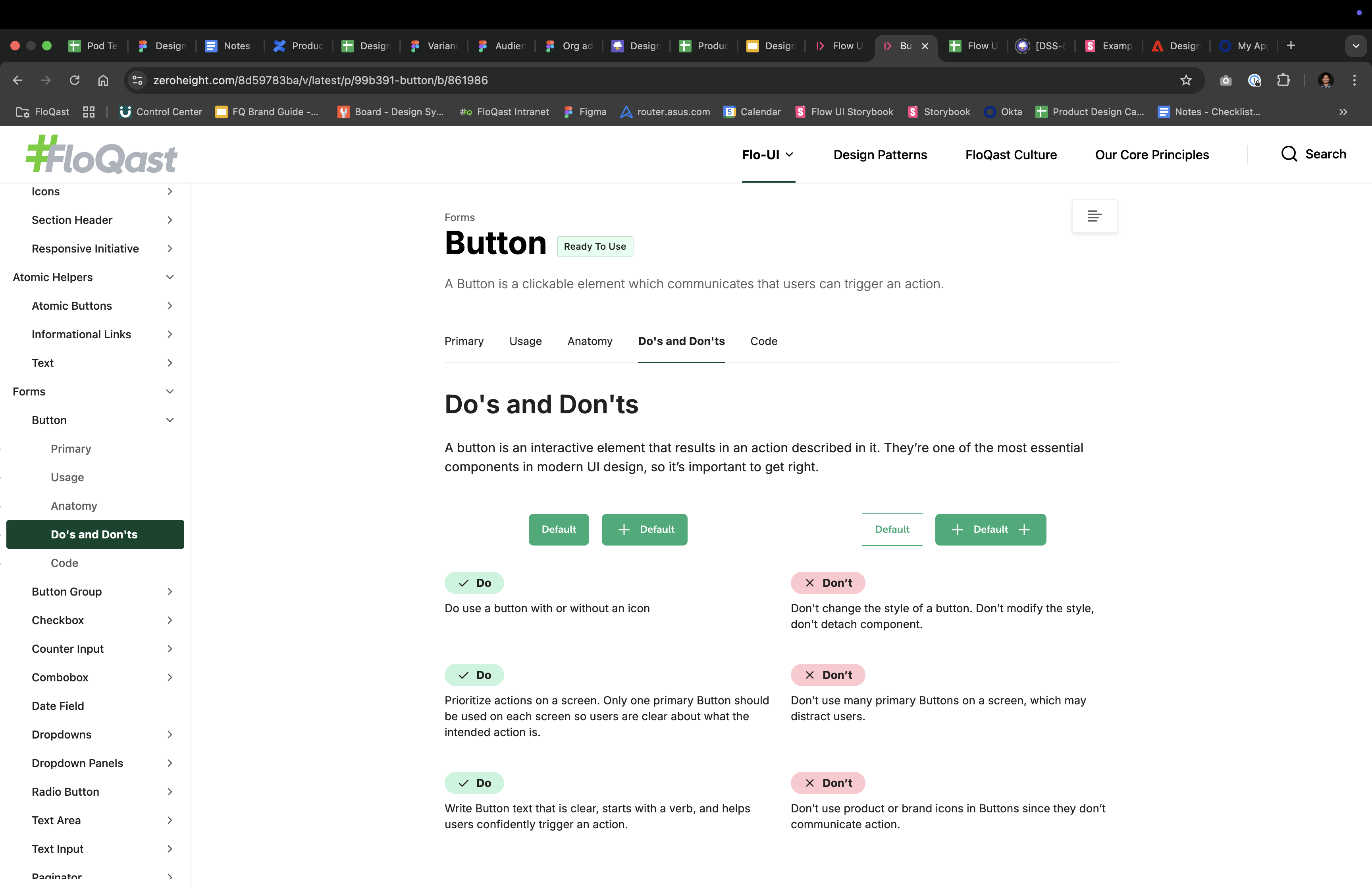
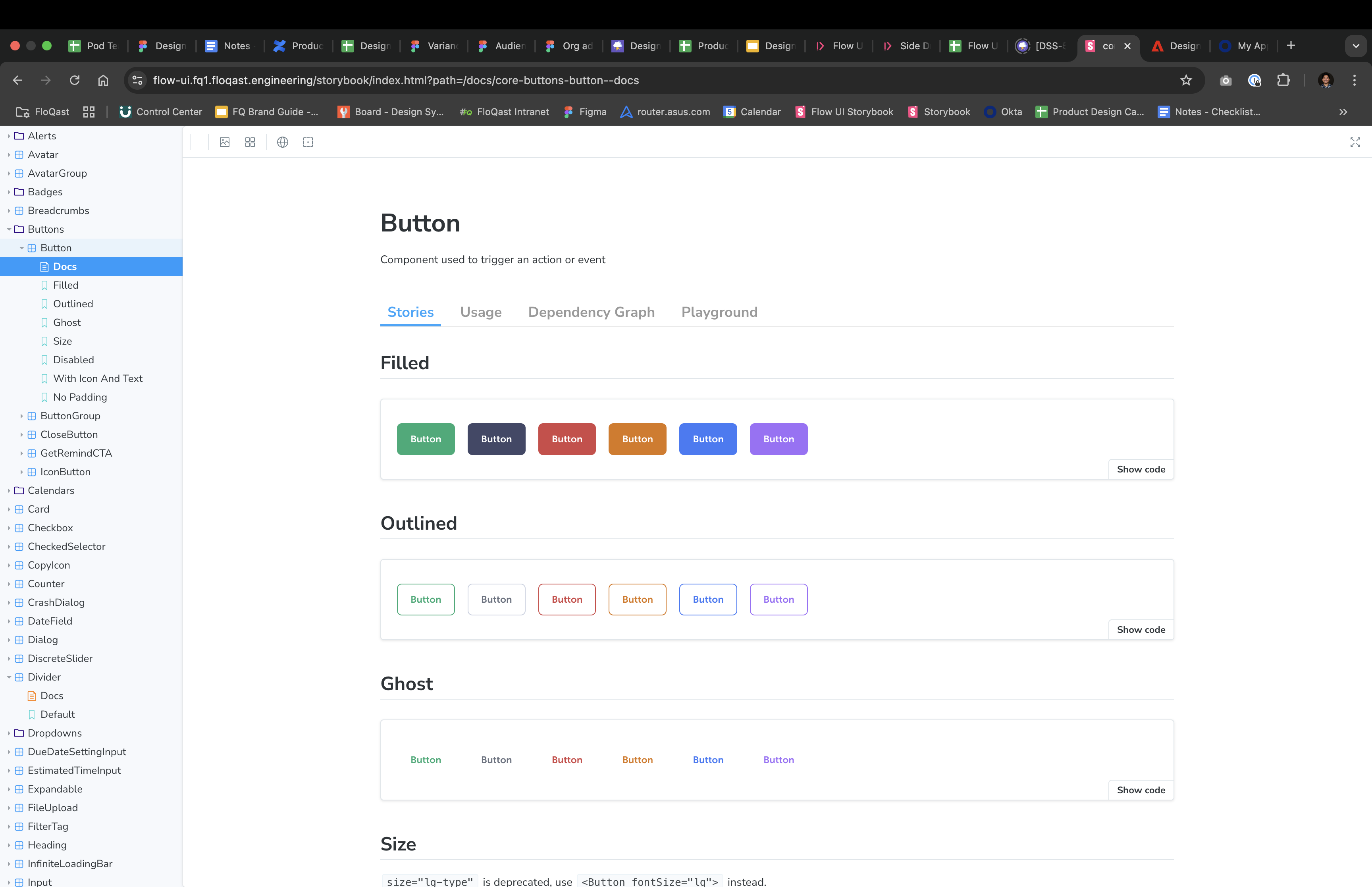
Left: Zeroheight do's and don'ts — Right: Storybook button component documentation
The measurable shift from fragmentation to consistency.
Homepage — drag to compare before and after the design system rollout
Reconciliations — drag to compare before and after the design system rollout
Measurable outcomes that validated the investment.
Building a culture of systems thinking.
Figma starter kits and annotated examples so new designers ship with Flow-UI in their first week.
Weekly system critiques that became the feedback loop between product work and system evolution.
PR-style reviews and shared Figma branches so any designer can propose components to the system.
Shifted the team's default from "build for this ticket" to "build for the platform." Weekly office hours for any team to bring questions, propose patterns, or flag duplication.