Case Study
Azibo
Building a modern property management platform from zero to one — rent collection, expense tracking, tenant management, and financial reporting in a single product.
Case Study
Building a modern property management platform from zero to one — rent collection, expense tracking, tenant management, and financial reporting in a single product.
Azibo is an all-in-one property management platform built for independent landlords and property managers. As the founding product designer, I built the entire product experience from scratch — design system, navigation, information architecture, and every core workflow.
Working directly with the CEO and CTO on product strategy, I helped shape the vision that contributed to a $10M Series A and grew the platform from zero to 5,000+ property managers in the first year.
Property managers — especially independent landlords managing 1–50 units — were stuck with a patchwork of tools. Rent collection happened through Venmo or paper checks. Expense tracking lived in spreadsheets. Tenant communication was scattered across email, text, and phone calls.
Enterprise solutions like Yardi and AppFolio existed, but they were bloated, expensive, and designed for large property management companies. Independent landlords needed a modern, all-in-one platform that handled rent collection, expense tracking, tenant management, and financial reporting without the enterprise overhead.
We conducted interviews with dozens of property managers — from solo landlords with 3 units to small companies managing 50+. The patterns were remarkably consistent across all segments.
Managers juggled 4–6 separate tools for rent, accounting, maintenance, and communication. No single source of truth for their portfolio.
Over 60% of landlords we interviewed still collected rent via paper checks or informal digital payments with no automated tracking.
Most couldn’t answer basic questions about their portfolio’s profitability without hours of manual reconciliation in spreadsheets.
No centralized communication history. Important conversations about leases, maintenance, and payments were scattered across channels.
No single platform handled the complete property management workflow. Managers were forced to juggle spreadsheets for bookkeeping, separate banking tools for rent collection, email for tenant communication, and manual processes for everything in between.
The opportunity was clear: build a unified platform that connects rent collection, expense tracking, banking, tenant management, and reporting into a single, coherent experience. And as the founding designer, I’d be building it all from scratch.
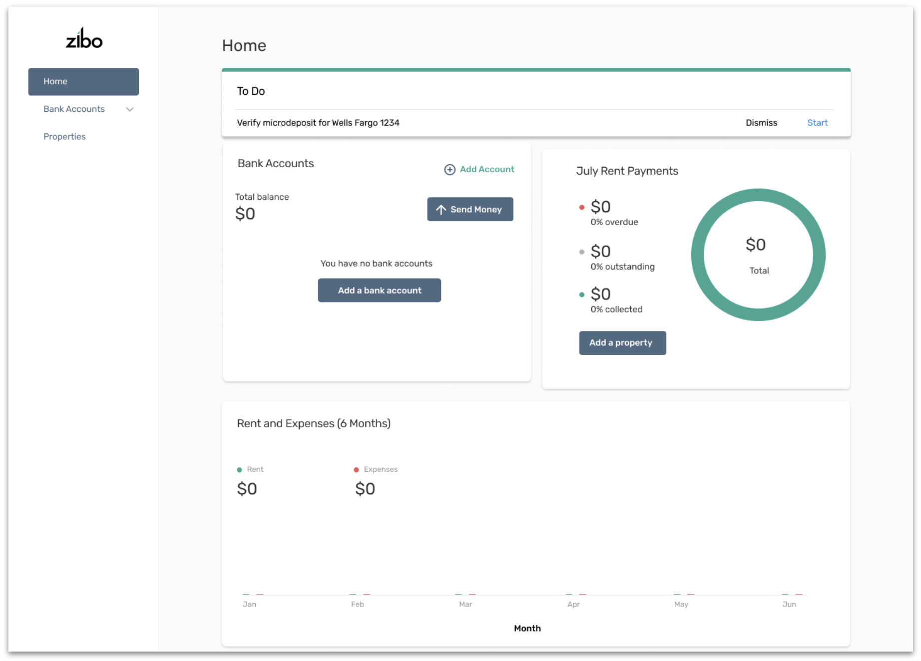
The starting point — the Azibo dashboard when I joined. A minimal MVP with basic rent collection and bank account widgets, but no tenant management, no portfolio-level view, and no financial reporting. This is what “4–6 tools stitched together” looked like from the product side.
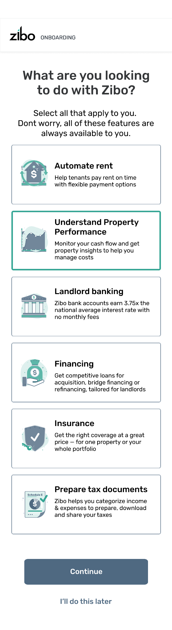
The old dashboard dropped new users into an empty state — $0 everywhere, no guidance, no next step. Most churned before ever adding a property. We designed a dynamic onboarding flow that lets users self-select what they want to do when joining the platform, then tailors the setup experience to their selections.
The flow works across desktop and mobile, with a “skip and come back” option at every step so users never feel locked in — a pattern that proved critical for landlords who juggle setup across multiple sessions.
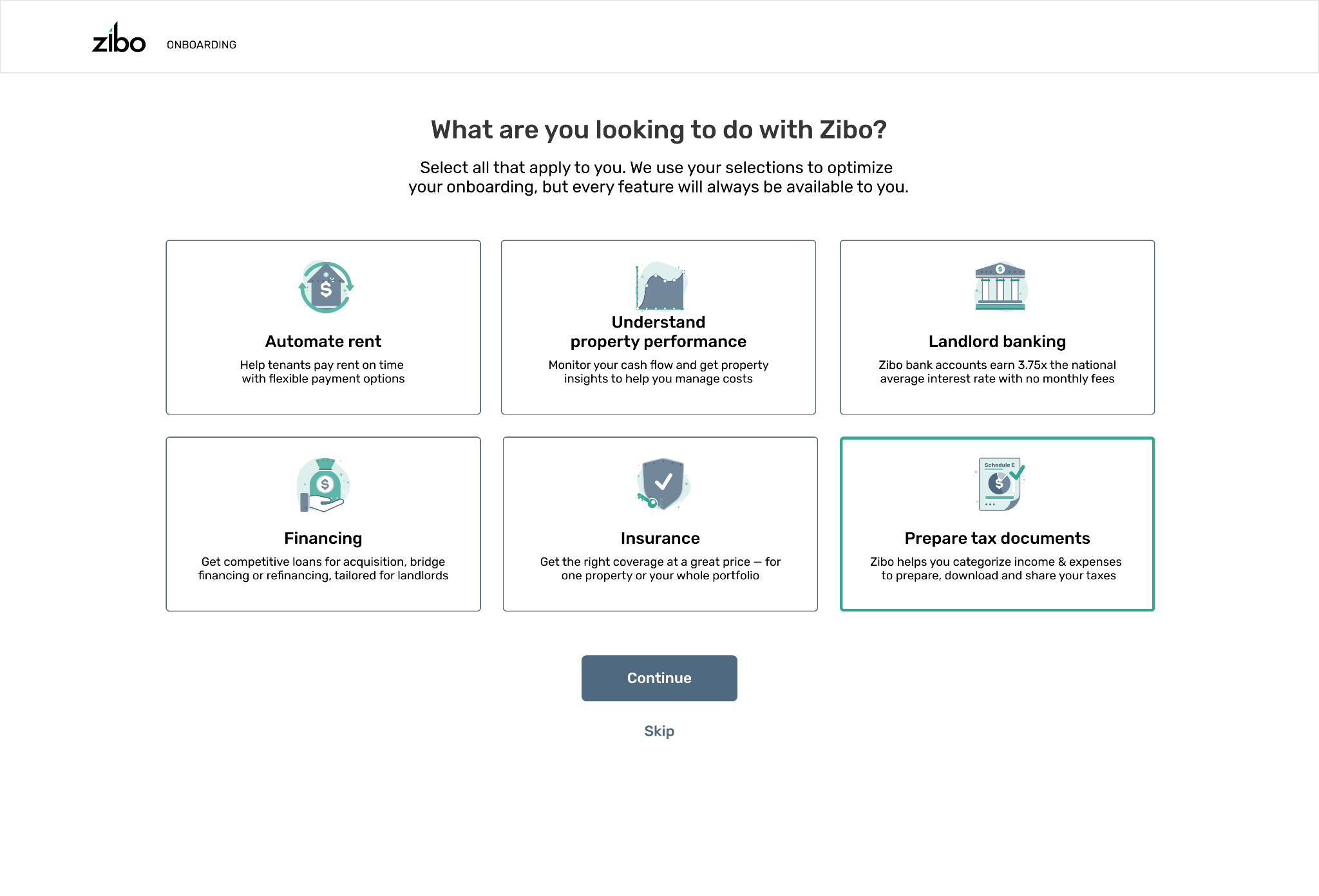
Desktop onboarding — “What are you looking to do with Zibo?” Users self-select their goals (Automate rent, Understand property performance, Landlord banking, Financing, Insurance, Prepare tax documents) and the platform tailors the setup experience to their selections.
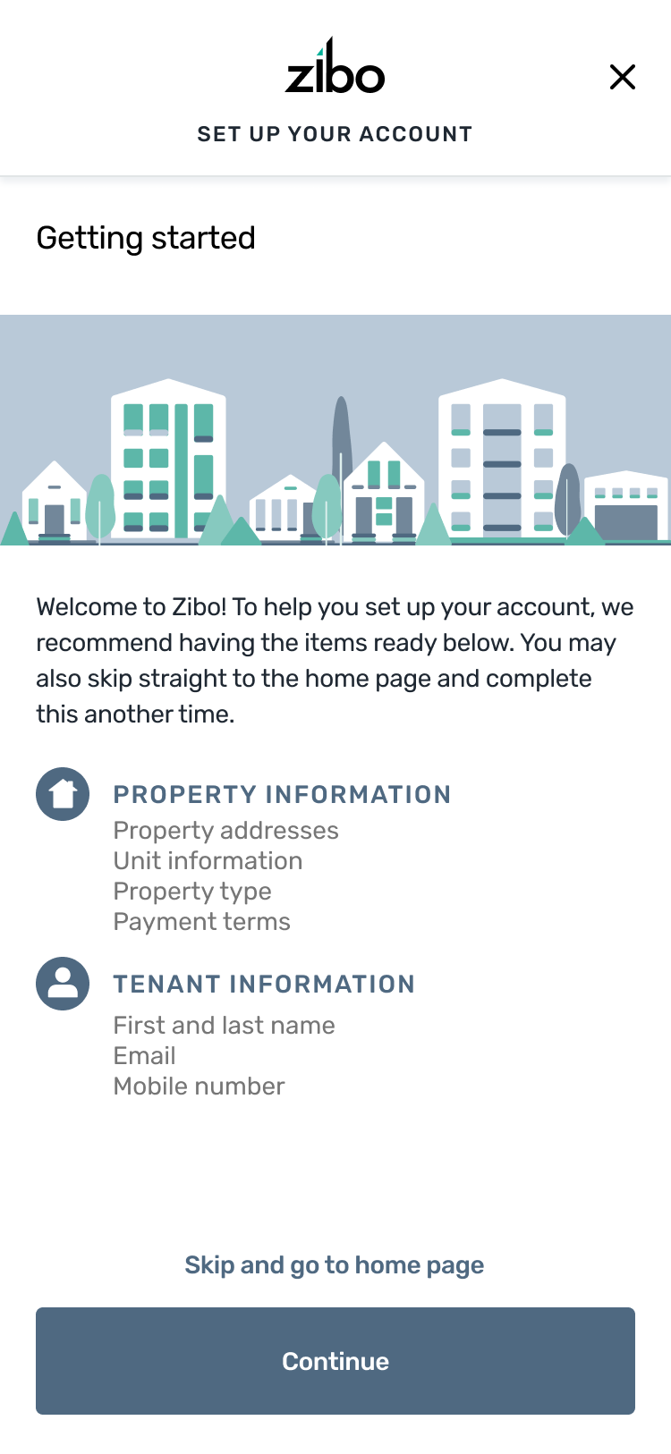
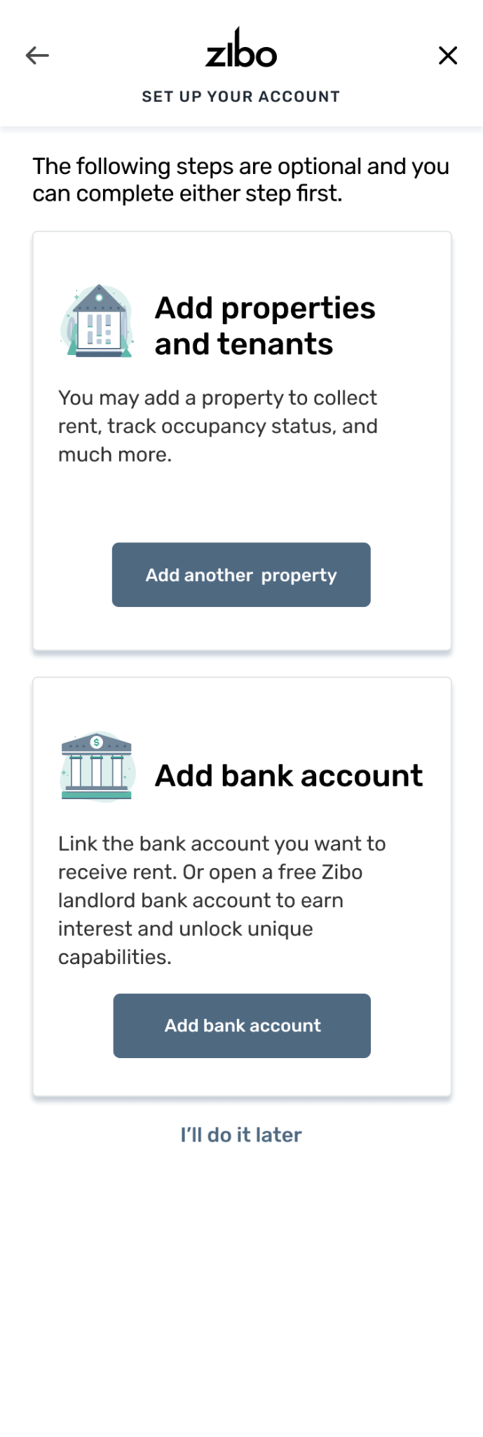
Mobile onboarding flow — Left: a guided “Getting Started” checklist showing what info to have on hand (property addresses, unit info, tenant names). Center: the goal-selection screen adapted for mobile with stacked cards. Right: optional setup steps for adding properties and linking a bank account, each skippable independently.
With a blank canvas, every structural decision mattered. I designed the navigation, site map, and user flows to balance the breadth of features (rent, expenses, banking, tenants, properties) with simplicity for first-time users.
The IA needed to work for a landlord managing 3 units and scale to someone managing 50+. We organized around the property manager’s mental model — properties as the anchor, with finances, tenants, and maintenance as connected dimensions.
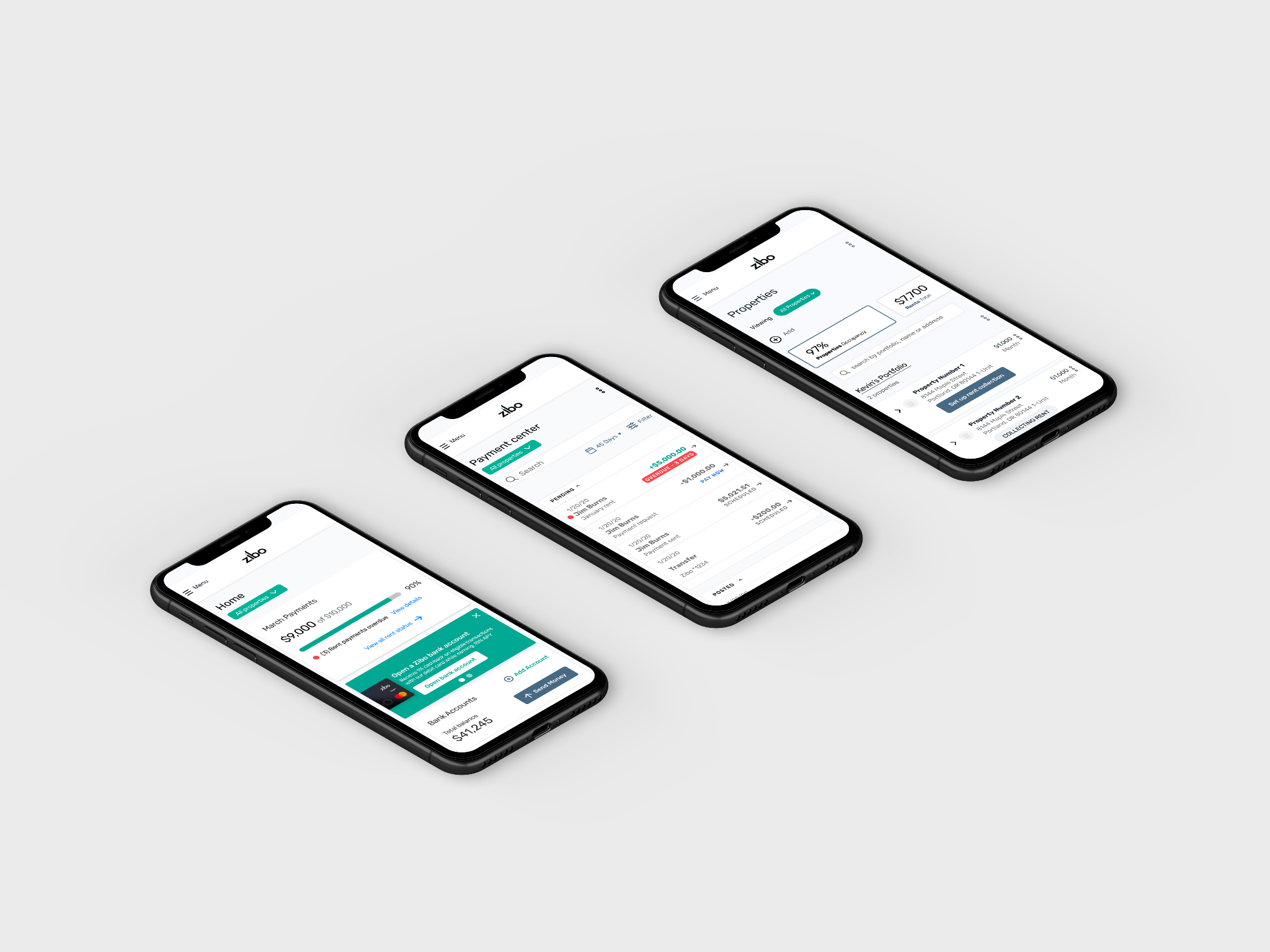
Core workflows across rent collection, property management, and financial reporting.
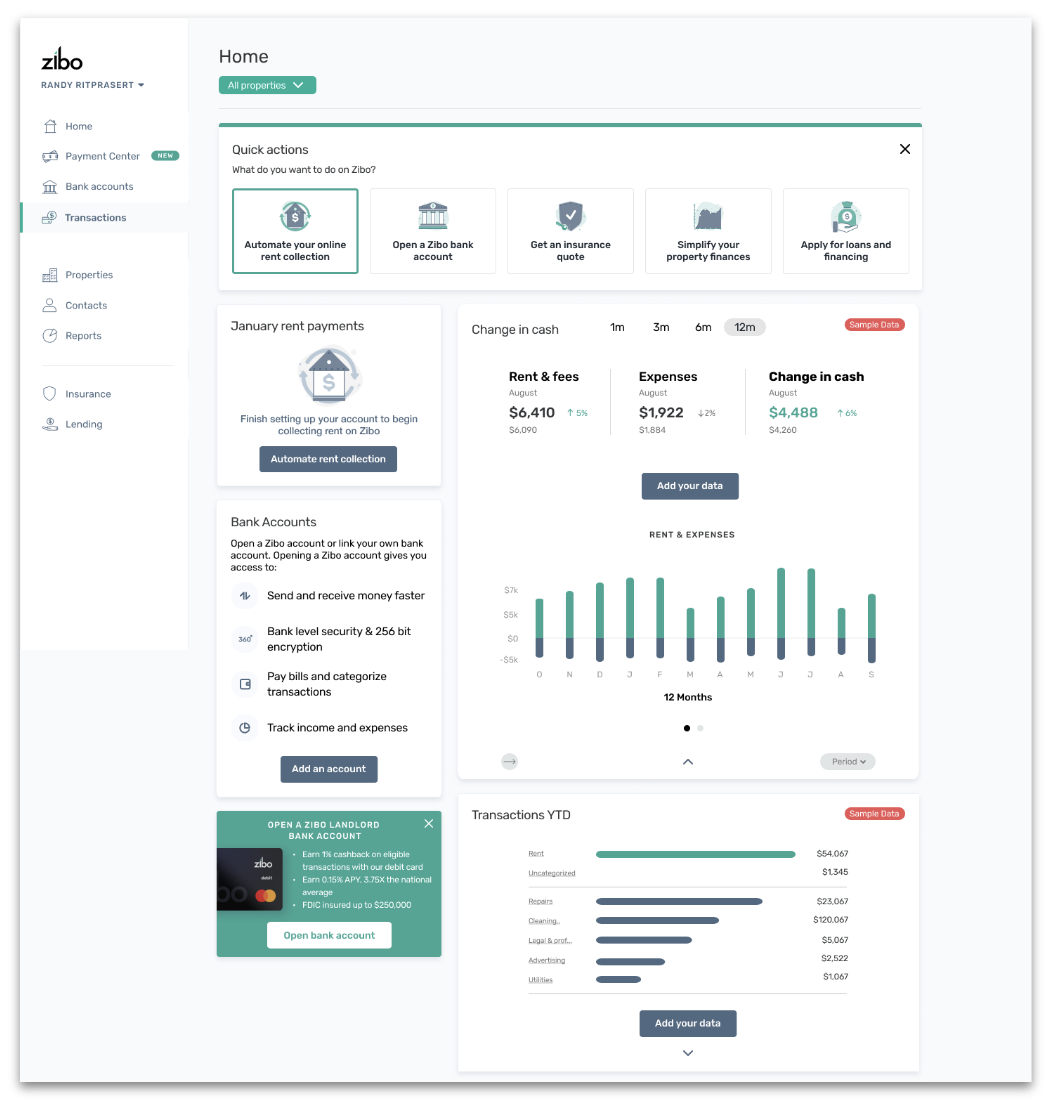
The redesigned dashboard — from a minimal MVP with three sidebar links and empty widgets to a unified home with Quick Actions onboarding, financial summaries, rent tracking, and transaction breakdowns. Every surface that was previously a separate spreadsheet or tool now lives in one view.
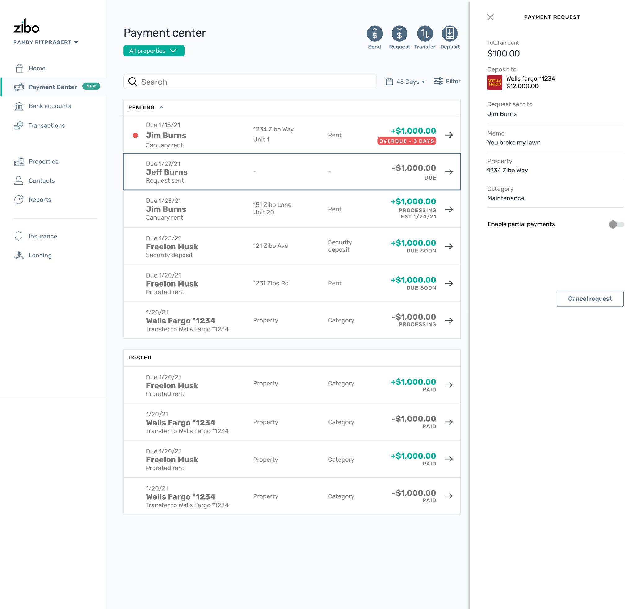
Payment Center — the unified transaction view that replaced the old “Bank Accounts” widget. Landlords can send, request, transfer, and deposit from one surface, with a detail panel for each payment request. Status badges (Overdue, Processing, Due Soon, Paid) give at-a-glance clarity that previously required cross-referencing a spreadsheet.
The mobile experience — landlords can track rent payments, manage properties, and monitor financials on the go with the same unified interface as the desktop platform.
From zero to a funded, growing product in 1.5 years.
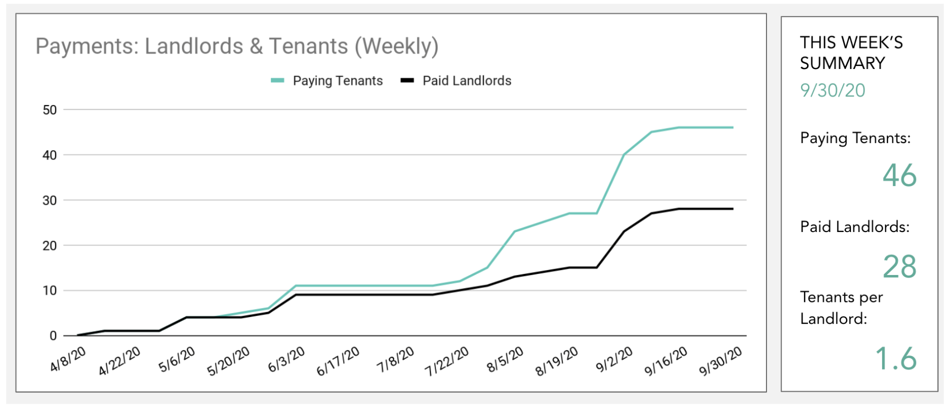
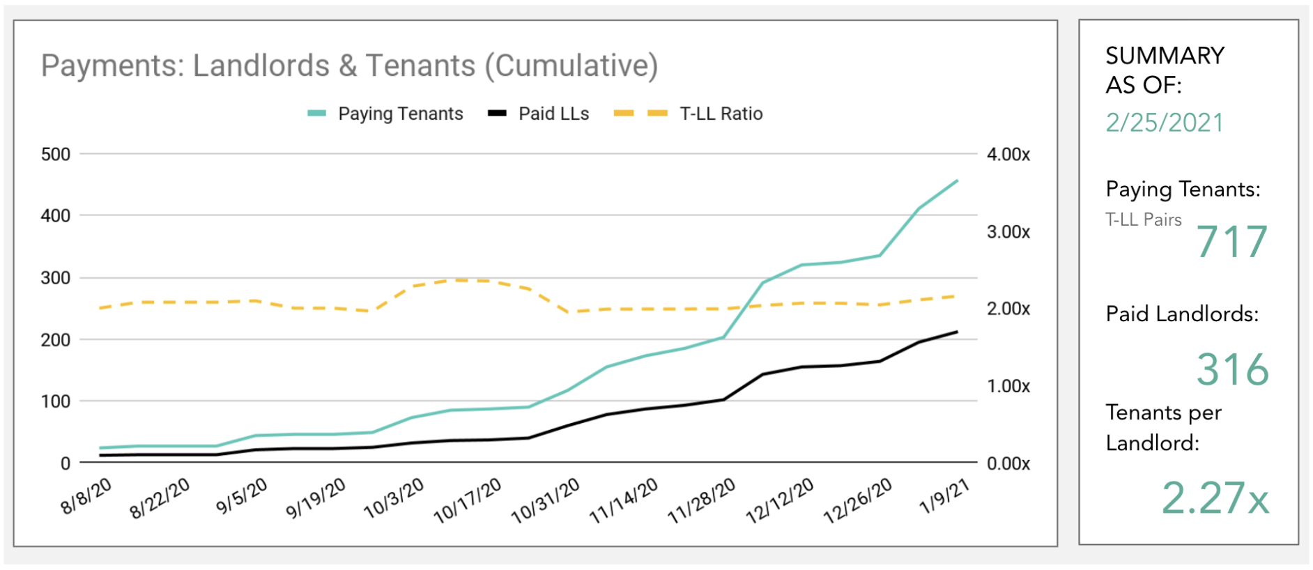
Left: early traction (Apr–Sep 2020) — weekly paying tenants grew from 0 to 46 and paid landlords from 0 to 28 in the first six months after launch. Right: sustained growth (Aug 2020–Feb 2021) — cumulative paying tenants reached 717 with 316 paid landlords at a 2.27x tenant-to-landlord ratio, validating that the platform was retaining and expanding its user base.
What I learned building a product from zero as the founding designer.
As the founding designer, there was no existing system to lean on. Every decision — from the color palette to the navigation structure — set a precedent that would compound. The discipline of thinking in systems from day one paid off as the product scaled.
Sitting in the room with the CEO and CTO meant design had a seat at the strategy table from the start. We didn’t just execute on specs — we shaped the product vision together, which meant design decisions were grounded in business context.
Building 80+ components without a team of design system specialists meant being ruthlessly pragmatic. I focused on the components that would unlock the most features first, iterated based on real product needs, and documented just enough to keep engineering aligned.